Difference between revisions of "1015: Kerning"
(Created page with "In this comic, a web designer is complaining about bad kerning on a sign. Kerning is the space between letters. Here, we can see that the 'C' and 'E' are improperly spaced. Th...") |
Blaisepascal (talk | contribs) (Added comic block, transcript) |
||
| Line 1: | Line 1: | ||
| + | {{comic | ||
| + | | number = 1015 | ||
| + | | date = February 10, 2012 | ||
| + | | title = Kerning | ||
| + | | image = kerning.png | ||
| + | | imagesize = | ||
| + | | titletext = I have never been as self-conscious about my handwriting as when I was inking in the caption for this comic. | ||
| + | }} | ||
| + | |||
| + | == Explanation == | ||
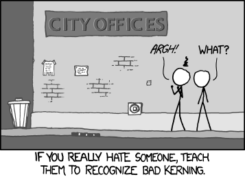
In this comic, a web designer is complaining about bad kerning on a sign. | In this comic, a web designer is complaining about bad kerning on a sign. | ||
Kerning is the space between letters. Here, we can see that the 'C' and 'E' are improperly spaced. This drives web designers crazy, so this person is trying to get his friend to recognize bad kerning. | Kerning is the space between letters. Here, we can see that the 'C' and 'E' are improperly spaced. This drives web designers crazy, so this person is trying to get his friend to recognize bad kerning. | ||
| + | == Transcript == | ||
| + | |||
| + | [Some IDIOT used a font with TERRIBLE kerning on the side of a building for a sign labeled "CITY OFFICES". Only.. you aren't even frickin' sure because of this terrible kerning, as the "C" and the "I" in "CITY" have waaay too strong kerning. And so do the "C" and the "E" in "OFFICES", to the point that it actually looks like TWO words. And the I and the C are so close together, they almost look like a freakish K! Two people stand in front of this sign. One notices all these obvious flaws, while the other exists in peaceful ignorance.] | ||
| + | Person 1: *Argh*! | ||
| + | Person 2: what? | ||
| + | If you really hate someone, teach them to recognize bad kerning. | ||
| + | |||
| + | {{Discussion}} | ||
Revision as of 03:14, 17 August 2012
| Kerning |
 Title text: I have never been as self-conscious about my handwriting as when I was inking in the caption for this comic. |
Explanation
In this comic, a web designer is complaining about bad kerning on a sign. Kerning is the space between letters. Here, we can see that the 'C' and 'E' are improperly spaced. This drives web designers crazy, so this person is trying to get his friend to recognize bad kerning.
Transcript
[Some IDIOT used a font with TERRIBLE kerning on the side of a building for a sign labeled "CITY OFFICES". Only.. you aren't even frickin' sure because of this terrible kerning, as the "C" and the "I" in "CITY" have waaay too strong kerning. And so do the "C" and the "E" in "OFFICES", to the point that it actually looks like TWO words. And the I and the C are so close together, they almost look like a freakish K! Two people stand in front of this sign. One notices all these obvious flaws, while the other exists in peaceful ignorance.] Person 1: *Argh*! Person 2: what? If you really hate someone, teach them to recognize bad kerning.
