explain xkcd talk:Community portal/Proposals
| |
This page is an archive of discussions from explain xkcd:Community portal/Proposals. Note: This page is kept for historical purposes. Do not alter it except to archive new discussions. |
XKCD Store link
I think there should be a link to the XKCD store on the left-hand navigation bar, just under "Main page". We don't want to inadvertently cost Mr Munroe money and force him back to his day job instead of drawing more XKCD :-) --SurturZ (talk) 20:23, 2 August 2012 (EDT)
- I don't see a prominent store link on the blog, so I'll wait for Jeff's input before adding that one. If we do add it, should we phrase the link "XKCD store"? --Philosopher Let us reason together. 20:27, 2 August 2012 (EDT)
- [1] - I'm cool with it, but maybe we put links to both xkcd and the xkcd store on the left, would be weird just to have the store link right? --Jeff (talk) 20:01, 3 August 2012 (EDT)
- Heh, yeah. --Philosopher Let us reason together. 20:12, 3 August 2012 (EDT)
- [1] - I'm cool with it, but maybe we put links to both xkcd and the xkcd store on the left, would be weird just to have the store link right? --Jeff (talk) 20:01, 3 August 2012 (EDT)
Moved from Talk:Main Page. --Philosopher Let us reason together. 00:42, 4 August 2012 (EDT)
I added both. I'm not quite sure about their placement, though - having them beneath the "Community portal" makes logical sense but doesn't look that great. --Philosopher Let us reason together. 01:42, 4 August 2012 (EDT)
- I don't think the store link should be that prominently displayed. The sidebar is important real estate, and we should put only the most essential links there. There's no reason we'd need have the XKCD store link readily available on every page. I suggest removing it from there and adding it somewhere on the wiki (we could have a page about it, for example, and place it in the meta category). --Waldir (talk) 12:36, 4 August 2012 (EDT)
Centralize discussion?
There seem to be three main places for discussion about the wiki, and we need to centralize these so people can all be in sync and prevent having a mess nobody can navigate. I suggesting redirecting this page (talk:Main Page) to the Community portal, and add a large notice to Jeff's talk page also suggesting using the Community portal instead. Current discussions can be moved there. What do you think? --Waldir (talk) 16:07, 3 August 2012 (EDT)
- There are some suggestions on how to organize the community portal here (basically using subpages for different purposes, similar to Wikipedia's various Village pumps). Please comment :) --Waldir (talk) 17:04, 3 August 2012 (EDT)
- I agree - my talk page is probably not the best place for general wiki discussion, this is better, but best to keep everything together! --Jeff (talk) 20:10, 3 August 2012 (EDT)
- I'm importing wikipedia:Template:Village pump to set something like that up. I'll put a working draft in place, feel free to modify as needed, ofc. --Philosopher Let us reason together. 21:24, 3 August 2012 (EDT)
Moved from Talk:Main Page. --Philosopher Let us reason together. 00:46, 4 August 2012 (EDT)
Site logo
Summary of current proposals:
The main image (top left of the wiki) is not the best image ever. You really need to update it.
Just an idea, because that text looks weird, or at least please add a transparent background instead of white for the logo (and center the text). --Grep (talk) 21:39, 1 August 2012 (EDT)
- I like it. What does everyone else think? (PS - don't forget to sign your entries on this page!) --Jeff (talk) 21:18, 1 August 2012 (EDT)
- I could go with that. Had been kicking around some ideas, and if I had any artistic aptitude, it might have looked very much like that: the black-hat retort; alternately: the lowercase blue xkcd that RM uses (sans comic figure watermark) with a "Explain" in a hand-written typeface in some other color splashed across the top left part of those letters. And yes, definitely with transparency. Just thoughts... ultimately, whatever the consensus is... IronyChef (talk) 01:51, 2 August 2012 (EDT)
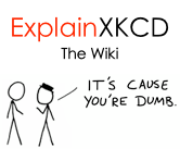
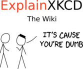
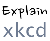
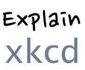
- I like that first one - File:wiki.png. And perhaps use that same text for the Tagline? --Philosopher Let us reason together. 19:50, 2 August 2012 (EDT)
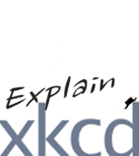
- Yeah, the first one captures what I was thinking. I thought I'd download it to tweak it a bit, and quickly proved to myself how unartistic I am. I was thinking the xkcd pretty much overwhelming the bottom (touching all three sides) and the explain (first typeface) in tight, maybe at a 5 degree angle over the x and k. Of course envisioning it is one thing, realizing it another (it may be totally unrealistic...) but I toss that out for further consideration. -- IronyChef (talk) 00:25, 3 August 2012 (EDT)
- Hmmm, rereading Philosopher's comment, I think he and I may have been talking about two different images. Ooops. Anyway, was just chatting with a buddy who is more artistic than I am, and he created this mashup. He suggested: "Establish some vocabulary. First, xkcd needs to be bigger; it defies describing, and refuses to be pidgeon-holed into a box, so the xkcd needs to be so big that it doesn't fit entirely in-frame ... the Explain part has got to be casual, to represent the wiki and informal nature of contributing to it, and you gotta have it in close, because the contributors are going to get as close as they can to the truth. And keep it simple." (I broke with that, and tried to add the black hat; in doing so, I think I trashed transparency, tough) Anybody think that's worth taking a run with it? -- IronyChef (talk) 01:04, 3 August 2012 (EDT)
   y
   o
   u
   '
 w r
ei e
xkcd
piau
l um
a sb
i e
n
Moved from User talk:Jeff. --Philosopher Let us reason together. 00:37, 4 August 2012 (EDT)
I prefer the first option (file:wiki.png). At the size the logo is meant to be, it's perfectly readable; furthermore, it's visually pleasant and it conveys the meaning well. We'll need it to be transparent, and editing the file at the current size produces sub-optimal results. Grep, could you please generate a transparent version of it and reupload it to overwrite the current image? --Waldir (talk) 05:14, 4 August 2012 (EDT)
- Slight problem. I don't have the original "it's cause your dumb," I just copied it from explainxkcd.com header, and trying to remove the whitespace myself makes, well, suboptimal results. The font used was Heiti SC/TC, if you or anybody else wants to make it themselves. Also, maybe using #6e7b91 for the XKCD or something... it's the color RM uses on the home page.
- I have uploaded a high res version of File:Wiki.png. Not exactly the same, but similar. I used FreeSans and a xkcd font I found at the xkcd forum. I still have the SVG version.--SlashMe (talk) 10:57, 4 August 2012 (EDT)
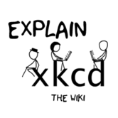
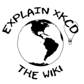
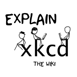
I suggest the two above this comment. Both of these are designs be me. The first one has a nice xkcd logo-text that features many of the main characters. I personally think that it looks better aesthetically. The second one is a globe that is kind of a nod to wikipedia. The ballon is there because that seems to be an often reappearing theme in xkcd. Now I really need to make a note of this, but xkcd should be in lower case letters unless it begins a sentence. This error exists almost everywhere on this wiki, but we should try to keep it out of the logo (http://xkcd.com/about/ for proof). Also I think that the logos that just say "explain xkcd" are too simple and kind of borring. The use of both black and blue additionally bothers me. Alek2407 (talk) 07:37, 5 August 2012 (EDT)
- I agree. I like the first one best, but Megan's hair could be tweaked a little because it doesn't look a lot like her right now. Do you think you could do that? --Waldir (talk) 08:31, 5 August 2012 (EDT)
- That's perfect :D I vote for this one. --Waldir (talk) 07:12, 6 August 2012 (EDT)
- By the way: could you make the background transparent instead of white? --Waldir (talk) 07:12, 6 August 2012 (EDT)
- ✓ Done We have a winner. Alek2407 - I'll leave a message on your contact page, but please email that logo to me with a transparent background. --Jeff (talk) 15:31, 6 August 2012 (UTC)
- Sent. 16:42, 6 August 2012 (UTC)
- I've rescaled the image (poorly) and i have asked Alek for a smaller version. --Jeff (talk) 03:25, 7 August 2012 (UTC)
- Remember it needs to be transparent as well. Also, I point you again to the suggestions I made below regarding how to properly setup the site logo. Replacing the image server-side is actually recommended against by MediaWiki documentation. --Waldir (talk) 10:51, 7 August 2012 (UTC)
- I've rescaled the image (poorly) and i have asked Alek for a smaller version. --Jeff (talk) 03:25, 7 August 2012 (UTC)
- Sent. 16:42, 6 August 2012 (UTC)
- ✓ Done We have a winner. Alek2407 - I'll leave a message on your contact page, but please email that logo to me with a transparent background. --Jeff (talk) 15:31, 6 August 2012 (UTC)
- By the way: could you make the background transparent instead of white? --Waldir (talk) 07:12, 6 August 2012 (EDT)
- That's perfect :D I vote for this one. --Waldir (talk) 07:12, 6 August 2012 (EDT)
I've always loved the "It's cause you're dumb" motto of the Explain xkcd blog, which furthermore is (to my knowledge) original to this website, so I strongly recommend a variant of file:wiki.png for the logo. "explain xkcd" (and probably "the wiki" as well) should, I believe, be written with the very same typeface and case (ie full lowercase) than in the header image displayed on top of http://explainxkcd.com. - Cos (talk) 12:31, 6 August 2012 (UTC)
I wasn't sure if Alek was going to do this or not, so I made a transparent copy of the logo and resized it to the optimal 135x135 pixels myself. Here it is (aaaand, another captcha!). Omega Talk • Contribs 09:50, 8 August 2012 (UTC)
- Thanks. I uploaded the image as a new version of File:Logo.png, so when Jeff does the configuration changes, the site logo should be automatically updated. --Waldir (talk) 11:34, 8 August 2012 (UTC)
Naming conventions
Wanted to start a discussion here on naming conventions, and two items come to mind:
- The name of Randall's site: XKCD or xkcd or Xkcd? I noticed that there, it's always written lowercase, when shown in uppercase, it's because it's in a small-caps or all-caps typeface. Should we follow suit?
- What is the name of this site? Explain XKCD, or ... ? Ultimately, I think this is Jeff's call, but I'm guessing the outcome may hinge on how we address the first question.
Should we normalize the references here to some convention, or leave the matter alone? I know that personally, I've always been writing lowercase xkcd, and usually using {{xkcd}} to link to the site (as in xkcd ) to maximize links back to the site. Thotz? == IronyChef (talk) 22:08, 5 August 2012 (EDT)
- For 1, I think there is no discussion needed, Randall makes this clear here: How do I write "xkcd"?. I already started changing some of the instances of all caps XKCD into lowercase xkcd on the wiki, but there are some places (such as in the logo, in the Explain XKCD namespace name, etc) that will require server access to fix. --Waldir (talk) 05:16, 6 August 2012 (EDT)
- Regarding 2, I was wondering the same when I started lowercasing xkcd. "Explain XKCD" makes more sense when xkcd is capitalized, but it looks a little weird IMO as "Explain xkcd". Maybe "explainxkcd"? "explain xkcd"? Or just ignore the initial strangeness and stay with "Explain xkcd"? --Waldir (talk) 05:16, 6 August 2012 (EDT)
-
- I'm 100% with the lowercase conversion of XKCD everywhere, per Randall's explanation (indicated by Waldir). Places where something needs to be done:
- logo
- "Explain XKCD" namespace (this could be tricky)
- site name (the thing that
{{SITENAME}}produces ; appears everywhere, see http://www.mediawiki.org/wiki/Manual:$wgSitename ) - and of course, in the content text (see Special:WhatLinksHere/XKCD for instance)
- Cos (talk) 12:19, 6 August 2012 (UTC)
- I'm 100% with the lowercase conversion of XKCD everywhere, per Randall's explanation (indicated by Waldir). Places where something needs to be done:
- Just to give credit where it's due, it was Alek2407 who first raised this problem, above :)
- That said, for the namespace change it would be trickier for any of the other default namespaces, but the project namespace can be easily configured by setting
$wgMetaNamespace = "Explain xkcd";in LocalSettings.php. The sitename can likewise be changed by changing, as you mentioned yourself,$wgSitename. It seems there is a consensus so I'll warn Jeff to take a look at that. - The logo definition should be changed from
$wgLogo = "$wgStylePath/common/images/wiki.png";to$wgLogo = "$wgUploadPath/c/c9/Logo.png". I've uploaded the current logo to File:Logo.png (note: even though it is saved with a png extension at http://www.explainxkcd.com/wiki/skins/common/images/wiki.png, it was actually a jpg file!), and protected the image, so afterwards when we decide on a logo (and should we ever need to make adjustments to it), we can simply upload a new version of that file without needing Jeff to change things server-side. I'll also ask Jeff to perform this change. --Waldir (talk) 15:15, 6 August 2012 (UTC)
