2048: Curve-Fitting
| Curve-Fitting |
 Title text: Cauchy-Lorentz: "Something alarmingly mathematical is happening, and you should probably pause to Google my name and check what field I originally worked in." |
Explanation[edit]
An illustration of several plots of the same data with curves fitted to the points, paired with conclusions that you might draw about the person who made them. These data, when plotted on an X/Y graph, appear to have a general upward trend, but the data is far too noisy, with too few data points, to clearly suggest any specific growth pattern. In such a case, many different mathematical and statistical models could be presented as roughly fitting the data, but none of them fits well enough to compellingly represent the data.
When modeling such a problem statistically, much of the work of a data scientist or statistician is knowing which fitting method is most appropriate for the data in question. Here we see various hypothetical scientists or statisticians each applying their own interpretations to the exact same data, and the comic mocks each of them for their various personal biases or other assorted excuses. In general, the researcher will specify the form of an equation for the line to be drawn, and an algorithm will produce the actual line.
Nonetheless scientists work much more seriously on the reliability of their assumptions by giving a value for the standard deviation represented by the Greek letter sigma σ or the Latin letter s as a measure to quantify the amount of variation of the data points against the presented best fit. If the σ-value isn't good enough an interpretation based on a specific fit wouldn't be accepted by the science community.
Since Randall gives no hint about the nature of the used data set - same in each graph - any fitting presented doesn't make any sense. The graphs could represent a star map, the votes for the latest elected presidents, or your recent invoices on power consumption. This comic just exaggerates various methods on interpreting data, but without the knowledge of the matter in the background nothing makes any sense.
Linear[edit]

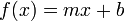
Linear regression is the most basic form of regression; it tries to find the straight line that best approximates the data. As it's the simplest, most widely taught form of regression, and in general differentiable functions are locally well approximated by a straight line, it's usually the first and most trivial attempt of fit.
The picture to the right shows how totally different data sets can result in the same line. It's obvious that some more basics about the nature of the data must be used to understand if this simple line really does make sense.
The comment below the graph "Hey, I did a regression." refers to the fact that this is just the easiest way of fitting data into a curve.
Quadratic[edit]
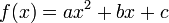
Quadratic fit (i.e. fitting a parabola through the data) is the lowest grade polynomial that can be used to fit data through a curved line; if the data exhibits clearly "curved" behavior (or if the experimenter feels that its growth should be more than linear), a parabola is often the first, easiest, stab at fitting the data.
The comment below the graph "I wanted a curved line, so I made one with math." suggests that a quadratic regression is used when straight lines no longer satisfy the researcher, but they still want to use simple math expression. Quadratic correlations like this are mathematically valid and one of the simplest kind of curve in math, but this curve doesn't appear to satisfy the data any better than does simple, linear regression.
Logarithmic[edit]

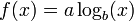
A logarithmic curve grows slower on higher values, but still grows without bound to infinity rather than approaching a horizontal asymptote. The small b in the formula represents the base which is in most cases e, 10, or 2. If the data presumably does approach a horizontal asymptote then this fit isn't an effective method to explain the nature of the data.
The comment below the graph "Look, it's tapering off!" builds up the impression that the data diminishes while under this fit it's still growing to infinity, only much slower than a linear regression does.
Exponential[edit]


An exponential curve, on the contrary, is typical of a phenomenon whose growth gets rapidly faster and faster - a common case is a process that generates stuff that contributes to the process itself; think bacteria growth or compound interest.
The logarithmic and exponential interpretations could very easily be fudged or engineered by a researcher with an agenda (such as by taking a misleading subset or even outright lying about the regression), which the comic mocks by juxtaposing them side-by-side on the same set of data.
The comment below the graph "Look, it's growing uncontrollably!" gives an other frivolous statement suggesting something like chaos. Also this even faster growth is well defined and has no asymptote at both axes.
LOESS[edit]
A LOESS fit doesn't use a single formula to fit all the data, but approximates data points locally using different polynomials for each "zone" (weighting data points differently as they get further from it) and patching them together. As it has many more degrees of freedom compared to a single polynomial, it generally "fits better" to any data set, although it is generally impossible to derive any strong, "clean" mathematical correlation from it - it is just a nice smooth line that approximates the data points well, with a good degree of rejection from outliers.
The comment below the graph "I'm sophisticated, not like those bumbling polynomial people." emphasises this more complicated interpretation, but without a simple mathematical description it's not very helpful to find informative interpretations of the underlying data.
Linear, No Slope[edit]

Also known as a constant function, since the function takes on the same (constant) value c for all values of x. The value of c can be determined simply by taking the average of the y-values in the data.
Apparently, the person making this line figured out pretty early on that their data analysis was turning into a scatter plot, and wanted to escape their personal stigma of scatter plots by drawing an obviously false regression line on top of it. Alternatively, they were hoping the data would be flat, and are trying to pretend that there's no real trend to the data by drawing a horizontal trend line.
The comment below the graph "I'm making a scatter plot but I don't want to." is probably done by a student who isn't happy with their choice of field of study.
Logistic[edit]

The logistic regression is taken when a variable can take binary results such as "0" and "1" or "old" and "young".
The curve provides a smooth, S-shaped transition curve between two flat intervals (like "0" and "1").
The comment below the graph "I need to connect these two lines, but my first idea didn't have enough math." implies the experimenter just wants to find a mathematically-respectable way to link two flat lines.
Confidence Interval[edit]
Not a type of curve fitting, but a method of depicting the predictive power of a curve.
Providing a confidence interval over the graph shows the uncertainty of the acquired data, thus acknowledging the uncertain results of the experiment, and showing the will not to "cheat" with "easy" regression curves.
The comment below the graph "Listen, science is hard. But I'm a serious person doing my best." is just an honest statement about this uncertainty.
Piecewise[edit]
Mapping different curves to different segments of the data. This is a legitimate strategy, but the different segments should be meaningful, such as if they were pulled from different populations.
This kind of fit would arise naturally in a study based on a regression discontinuity design. For instance, if students who score below a certain cutoff must take remedial classes, the line for outcomes of those below the cutoff would reasonably be separate from the one for outcomes above the cutoff; the distance between the end of the two lines could be considered the effect of the treatment, under certain assumptions. This kind of study design is used to investigate causal theories, where mere correlation in observational data is not enough to prove anything. Thus, the associated text would be appropriate; there is a theory, and data that might prove the theory is hard to find.
One notable time this is used is when a researcher studying housing economics is trying to identify housing submarkets. The assumption is that if two proposed markets are truly different, they will be better described using two different regression functions than if one were to be used.
The additional curved lines visible in the graph are the kind of confidence intervals you'd get from a simple OLS regression if the standard assumptions were valid. In the case of two separate regressions, it would be surprising if all those assumptions (that is, i.i.d. Normal residuals around an underlying perfectly-linear function) were in fact valid for each part, especially if the slopes are not equal.
A classical example in physics are the different theories to explain the black body radiation at the end of the 19th century. The Wien approximation was good for small wavelengths while the Rayleigh–Jeans law worked for the larger scales (large wavelength means low frequency and thus low energy.) But there was a gap in the middle which was filled by the Planck's law in 1900.
The comment below the graph "I have a theory, and this is the only data I could find." is a bit ambiguous because there are many data points ignored. Without an explanation why only a subset of the data is used this isn't a useful interpretation at all. As a matter of fact, with the extra degrees of freedom offered by the piecewise regression, it could indicate that the researcher is trying to fit the data to confirm their theory, rather than building their theory off of the data.
Connecting lines[edit]
This is often used to smooth gaps in measurements. A simple example is the weather temperature which is often measured in distinct intervals. When the intervals are high enough it's safe to assume that the temperature didn't change that much between them and connecting the data points by lines doesn't distort the real situation in many cases.
The comment below the graph "I clicked 'Smooth Lines' in Excel." refers to the well known spreadsheet application from Microsoft Office. Like other spreadsheet applications it has the feature to visualize data from a table into a graph by many ways. "Smooth Lines" is a setting meant for use on a line graph, a graph in which one axis represents time; as it simply joins up every point using bezier (or similar) curves as necessary to pass through every point (rather than finding a more sensible line that accepts some minimal but non-zero acceptible level of error in the datapoints), it is not suitable for regression.
Ad-Hoc Filter[edit]
Drawing a bunch of different lines by hand, keeping in only the data points perceived as "good". Not really useful except for marketing purposes.
The comment below the graph "I had an idea for how to clean up the data. What do you think?" admits that in fact the data is whitewashed and tightly focused to a result the presenter wants to show.
House of Cards[edit]
Not a real method, but a common consequence of misapplication of statistical methods: a curve can be generated that fits the data extremely well, but immediately becomes absurd as soon as one glances outside the training data sample range, and your analysis comes crashing down "like a house of cards". This is a type of overfitting. In other words, the model may do quite well for (approximately) interpolating between values in the sample range, but not extend at all well to extrapolating values outside that range.
Note: Exact polynomial fitting, a fit which gives the unique  th degree polynomial through
  points, often display this kind of behaviour.
The comment below the graph "As you can see, this model smoothly fits the- wait no no don't extend it AAAAAA!!" refers to a curve which fits the data points relatively well within the graph's boundaries, but beyond those bounds fails to match at all.
Cauchy-Lorentz (title text)[edit]
Cauchy-Lorentz is a continuous probability distribution which does not have an expected value or a defined variance. This means that the law of large numbers does not hold and that estimating e.g. the sample mean will diverge (be all over the place) the more data points you have. Hence very troublesome (mathematically alarming).
Since so many different models can fit this data set at first glance, Randall may be making a point about how if a data set is sufficiently messy, you can read any trend you want into it, and the trend that is chosen may say more about the researcher than about the data. This is a similar sentiment to 1725: Linear Regression, which also pokes fun at dubious trend lines on scatterplots.
A brief Google search reveals that Augustin-Louis Cauchy originally worked as a junior engineer in a managerial position. Upon his acceptance to the Académie des Sciences in March 1816, many of his peers expressed outrage. Despite his early work in "mere" engineering, Cauchy is widely regarded as one of the founding influences in the rigorous study of calculus & accompanying proofs. Notably, his later work included theoretical physics, and Lorentz was also a well-known physicist. Therefore, the title-text may be referring back to 793: Physicists.
Alternately, the title-text could be implying that the person who applied the Cauchy-Lorentz curve-fitting method may not be well qualified to the task assigned.
Transcript[edit]
- Curve-Fitting Methods
- and the messages they send
- [In a single frame twelve scatter plots with unlabeled x- and y-axes are shown. Each plot consists of the same data-set of approximately thirty points located all over the plot but slightly more distributed around the diagonal. Every plot shows in red a different fitting method which is labeled on top in gray.]
- [The first plot shows a line starting at the left bottom above the x-axis rising towards the points to the right.]
- Linear
- "Hey, I did a regression."
- [The second plot shows a curve falling slightly down and then rising up to the right.]
- Quadratic
- "I wanted a curved line, so I made one with math."
- [At the third plot the curve starts near the left bottom and increases more and more less to the right.]
- Logarithmic
- "Look, it's tapering off!"
- [The fourth plot shows a curve starting near the left bottom and increases more and more steeper towards the right.]
- Exponential
- "Look, it's growing uncontrollably!"
- [The fifth plot uses a fitting to match many points. It starts at the left bottom, increases, then decreases, then rapidly increasing again, and finally reaching a plateau.]
- LOESS
- "I'm sophisticated, not like those bumbling polynomial people."
- [The sixth plot simply shows a line above but parallel to the x-axis.]
- Linear, no slope
- "I'm making a scatter plot but I don't want to."
- [At plot #7 starts at a plateau above the x-axis, then increases, and finally reaches a higher plateau.]
- Logistic
- "I need to connect these two lines, but my first idea didn't have enough Math."
- [Plot #8 shows two red lines embedding most points and the area between is painted as a red shadow.]
- Confidence interval
- "Listen, science is hard. But I'm a serious person doing my best."
- [Plot #9 shows two not connected lines, one at the lower left half, and one higher at the right. Both have smaller curved lines in light red above and below.]
- Piecewise
- "I have a theory, and this is the only data I could find."
- [The plot at the left bottom shows a line connecting all points from left to right, resulting in a curve going many times up and down.]
- Connecting lines
- "I clicked 'Smooth Lines' in Excel."
- [The next to last plot shows a echelon form, connecting a few real and some imaginary points.]
- Ad-Hoc filter
- "I had an idea for how to clean up the data. What do you think?"
- [The last plot shows a wave with increasing peak values. Finally the plot of the wave is continued beyond the x- and y-axis borders.]
- House of Cards
- "As you can see, this model smoothly fits the- wait no no don't extend it AAAAAA!!"
Trivia[edit]
- This is the comic 2048, or 211. In addition to being the name of a popular app referenced in 1344: Digits, this is an extremely round number in binary (100,000,000,0002). 1000: 1000 Comics pointed out that comic 1024 would be a round number, but there were not any comics noting 2048.
- This comic is similar to 977: Map Projections which also uses a scientific method not commonly thought about by the general public to determine specific characteristics of one's personality and approach to science.
- Regressions have been the subject of several previous comics. 1725: Linear Regression was about linear regressions on uncorrelated or poorly correlated data. 1007: Sustainable, 1204: Detail and 1281: Minifigs depict linear regressions on data that was actually logistic, leading to bizarre extrapolations. 605: Extrapolating shows a line extrapolating from just two data points.
Discussion
House of Cards: Not a real method, but a common consequence of mis-application of statistical methods: a curve can be generated that fits the data extremely well, but immediately becomes absurd as soon as one glances outside the training data sample range, and your analysis comes crashing down "like a house of cards". This is a type of _overfitting_
I'm pretty sure it refers to the TV show house of cards, the dots representing the quality of the series increasing until Netflix renewed it a bit too much 172.68.26.65 (talk) (please sign your comments with ~~~~)
- This was my initial interpretation as well, since you can hypothetically extend a literal house of cards indefinitely.172.68.58.83 14:23, 20 September 2018 (UTC)
Could someone familiar with the show expand on this? Also a potential reference to the TV show, House of Cards ("WAIT NO, NO, DON'T EXTEND IT!"). Some context on what that line meant in House of Cards would be helpful. - CRGreathouse (talk) 14:20, 21 September 2018 (UTC)
I'm a little mystified by the alt-text. Cauchy and Lorentz both seem like mathematically capable people. What am I missing? 172.69.62.226 17:46, 19 September 2018 (UTC)
- Google-Fu reveals that it's a continuous probability distribution. This isn't bad per se, but it is quite visually distinctive and also can be quite...concerning if the data set isn't one where probability should be an issue. Werhdnt (talk) 18:00, 19 September 2018 (UTC)
- This is not the issue, but the fact that the moments (such as mean and variance) of the distribution don't exist = converge. See edited explanation. So if you wanted to estimate the parameters of the distribution, taking the sample mean for example will not converge with the number of data points, and is therefore bad to attempt. It is more mathematically alarming than alarmingly mathematical. GamesAndMath
- My own Google-Fu brought me to a page with this information: “The distribution is important in physics as it is the solution to the differential equation describing forced resonance, while in spectroscopy it is the description of the line shape of spectral lines.” (from here: https://www.boost.org/doc/libs/1_53_0/libs/math/doc/sf_and_dist/html/math_toolkit/dist/dist_ref/dists/cauchy_dist.html) Justinjustin7 (talk) 18:09, 19 September 2018 (UTC)
- True, but the "check what field I originally worked in" indicates that there might be something else going on with the meaning. 108.162.237.238 12:47, 20 September 2018 (UTC)
- I believe the point of "check what field I originally worked in" is that if somebody wasn't trained in statistics using an exotic distribution is highly suspect and suggest that either they are torturing the data to get desired results or have no idea what they are doing. 108.162.246.11 05:19, 21 September 2018 (UTC)
To be honest, I'm a bit disappointed. I kinda expected a special comic with such a nice round number.. Been counting down since comic #2000... 162.158.92.184 18:14, 19 September 2018 (UTC)
Different anon here, I think this is very special and if Randall makes a poster available I will be buying several to give away. Of course, part of my business is experimental data analysis and modeling...and this is a fantastic summary of common errors. 162.158.75.22 (talk) (please sign your comments with ~~~~)
- Agreed. This is a very special comic, and a highly subtle title text. Direct any of your friends who do data analysis here. Sort of the next stage from the classic "correlation is not causation" comic https://xkcd.com/552/ . -- GamesAndMath (talk) (please sign your comments with ~~~~)
Curve-Fitting
How fitting works needs to be explained. f(x)=mx+b works fine for single values, but how do we get that red line from the data set? --Dgbrt (talk) 20:12, 19 September 2018 (UTC)
- Generally, you decide for some error function and then search for parameters where the sum of errors for all data points is minimal. -- Hkmaly (talk) 22:07, 19 September 2018 (UTC)
- A typical error function is the square of the difference between the fit and the actual data point, hence "sum of squares" method. There are well-known standard formulas for finding m and b in the case of linear regression. In a linear algebra class, I saw a general method that would work for several of these (any where the fit is y = af(x)+bg(x)+...+ch(x), which includes log, exponential, quadratic, cubic, etc). I wish I could remember it. Blaisepascal (talk) 22:39, 19 September 2018 (UTC)
- I wish we could include the graphics at the top of [1] and [2] in the explanation. A lot of people are going to look at this one. 172.68.133.168 17:51, 20 September 2018 (UTC)
The data points do not have error bars, which makes the choice of fit even more ludicrous, in my opinion. If the data are that good, then I don't believe there is a correlation, it's random with some distribution. I might hang this up at work...Arppix (talk) 02:46, 20 September 2018 (UTC)
- And of course in serious science data points have error bars. This makes the fitting even more complicated and should be mentioned at the explanation. Because Randall doesn't use error bars I'm sure he refers to presentations not based on real science. Also this should be mentioned here. --Dgbrt (talk) 21:06, 20 September 2018 (UTC)
I hate to be negative here, as obviously some users have put a lot of effort into explaining the details behind each of the curve-fitting methods, but there's absolutely no explanation for Randall's comments on each method. While someone might learn something about the various methods by reading the explanation, they would not gain any insight on what Randall is saying about each method. In addition, the Connecting Lines explanation totally missed the fact that this isn't really even a curve-fitting method - it's just a feature of graphing software (in this case, Excel) where a smooth line is drawn through each data point from left to right rather than an example of overfitting to the data set. I think we could do better. Ianrbibtitlht (talk) 02:53, 21 September 2018 (UTC)
- You're not negative, Randall's comments are missing which I've just added into the incomplete reason. And sure other explanations still need a review. --Dgbrt (talk) 20:32, 21 September 2018 (UTC)
Everyone is missing the deeper trolling here of the fisheries community at large, which shall become blindingly clear here. First, this is cartoon number 2048 (2^11), a highly interesting number. Notably, this is the year all fisheries were projected to be collapsed by Worm et al. (2006) Science 314:787-790, a prediction which gained huge attention in the media and took on a life of its own. The prediction was based on fitting a power curve to some data on collapses in catch trends. Numerous rebuttals followed, one of which pointed out that a linear fit to the data is a better fit, and predicts all fisheries collapsed in 2114 (Jaenike et al. 2007, Science 316:1285a). A list of rebuttals is found here: https://sites.google.com/a/uw.edu/most-cited-fisheries/controversies/2048-projection. Later work by the same author and critics found a different prediction and showed rebuilding of fisheries is likely (Worm et al. 2009 Science 325:578-585). Second, lest you think this is a conspiracy theory, I note that in xkcd cartoon 887, Munroe specifically notes this prediction "The future according to google search results... 2048: "Salt-water fish extinct from overfishing" https://xkcd.com/887/. Third, this kind of model-fitting exercise has long plagued fisheries researchers attempting to predict recruitment from spawning biomass. 108.162.246.11 (talk) (please sign your comments with ~~~~)
"Ad hoc filter: Drawing a bunch of different lines by hand, keeping in only the data points perceived as "good". Also not useful. " – I guess it rather refers to data filtering, where for each point you take several points around and try to calculate some kind of mean, e.g. by rejecting most extreme points, or calculating median (see https://en.wikipedia.org/wiki/Median_filter). So it is an algorithm, not actually drawing lines by hand. Still it is tricky to draw conclusions and you can easily fool yourself with this method. 162.158.93.21 (talk) (please sign your comments with ~~~~)
Anyways, what is the actual regression of the plot? 162.158.154.241 (talk) (please sign your comments with ~~~~)
- This also must be better explained: We don't know what the points represent. The fraction of apples vs. bananas harvested by time, the position of stars in the sky, on a logarithmic scale, linear, or maybe the height of mountains in New Jersey... There are just some dots on paper with no further meaning. Thus everything Randall presents is valid by some means but an actual regression does not exist. --Dgbrt (talk) 20:32, 21 September 2018 (UTC)
Just want to note that the Piecewise models is actually a type of modelling often used in housing economics. It has been used to check if different types of housing are priced according to different rules. 172.68.34.34 22:05, 21 September 2018 (UTC)
Excel's "smooth lines" are actually splines (third-order Bezier splines, apparently) so they're not completely without mathematical merit. Still wildly unsuited for extrapolation, but often very well suited to interpolation. JohnWhoIsNotABot (talk) 21:44, 24 September 2018 (UTC)
Specific functions
In both the logarithmic and exponential functions, I have deleted the term "+ c" that was present in both. Simply put, these functions do not include an additive constant. To include the constant removes a basic property of e.g. exponential functions, which is that the function should grow by the same factor for equal increases in the value of x. (In other words, if the functions doubles when x changes from 1 to 2, then it should double again when x changes from 2 to 3, or from 3 to 4, etc.) If this does not happen, the function is not exponential. Redbelly98 (talk) 19:52, 13 October 2018 (UTC)
Logistic Curve
The explanation for logistic curve currently says it is used for binary values. It's actually a lot more useful than that. For example, population growth is often described as a logistic curve. It appears to be climbing exponentially initially, but then tapers off as resources can no longer support the population. 108.162.246.191 15:31, 8 November 2018 (UTC)
- The explanation mentions the logistic regression ranging between "0" and "1". It uses the more general logistic function you probably refer to. The logistic regression uses in its basic form a logistic function to model a binary dependent variable. Both Wikipedia links explain the difference. Honestly, I'm not an expert on that matter but that binary interpretation wouldn't allow values above "1" or below "0" as shown in the picture. Maybe worth to be mentioned. Nonetheless all other fittings are also similar nonsense. Maybe we could mention the more general Sigmoid function but this only barely fits to the title "Logistic Curve". --Dgbrt (talk) 23:09, 8 November 2018 (UTC)
Personally, I think the exponential fit seems like the most reasonable interpretation of the data.
Is the bottom right one considered as part of the Runge Phenomenon?"
As learnt in college, where trying to build an overlapping polynomial equation to a graph would create a working model until you move to the side and see the equation that worked until now going way off base 19:56, 3 April 2023 (UTC)D
