Also, help us explain Randall's What If? articles! We need to add the missing summaries and fix the existing ones. (see here)
Difference between revisions of "2400: Statistics"
(category comics with color added due to the red line on the hot damn chart) |
|||
| Line 11: | Line 11: | ||
This comic is another comic in a [[:Category:COVID-19|series of comics]] related to the {{w|2019–20 coronavirus outbreak|2020 pandemic}} of the {{w|coronavirus}} {{w|SARS-CoV-2}}, which causes {{w|COVID-19}}. | This comic is another comic in a [[:Category:COVID-19|series of comics]] related to the {{w|2019–20 coronavirus outbreak|2020 pandemic}} of the {{w|coronavirus}} {{w|SARS-CoV-2}}, which causes {{w|COVID-19}}. | ||
| + | |||
| + | The advice here could be seen as the inverse of the "science tip" in [[2311: Confidence Interval]], in which the data was so ''bad'' that its error bars fell outside of the graph and were not shown. | ||
==Transcript== | ==Transcript== | ||
| Line 21: | Line 23: | ||
[[Category:COVID-19]][[Category:Comics with color]] | [[Category:COVID-19]][[Category:Comics with color]] | ||
| + | [[Category:Tips]] | ||
Revision as of 23:19, 18 December 2020
| Statistics |
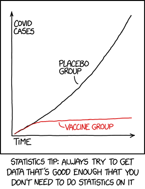
 Title text: We reject the null hypothesis based on the 'hot damn, check out this chart' test. |
Explanation
| This explanation is incomplete: Created by a PLACEBO GROUP. Please mention here why this explanation isn't complete. Do NOT delete this tag too soon. If you can fix this issue, edit the page! |
This comic is another comic in a series of comics related to the 2020 pandemic of the coronavirus SARS-CoV-2, which causes COVID-19.
The advice here could be seen as the inverse of the "science tip" in 2311: Confidence Interval, in which the data was so bad that its error bars fell outside of the graph and were not shown.
Transcript
| This transcript is incomplete: Do NOT delete this tag too soon. If you can fix this issue, edit the page! |
- [Shown is a graph with the x-axis labeled "time" and the y-axis labeled "COVID cases." There is a black line on the graph labeled "placebo group", which has a roughly linear slope moving toward the top right corner. There is a red line labeled "vaccine group", which follows the black line for about an eighth of the width of the graph before leveling off.]
- Caption beneath the graph: Statistics tip: Always try to get data that's good enough that you don't need to do statistics on it
Discussion
This is a representation of the actual graph showing the efficacy of the Pfizer/BioNTech coronavirus vaccine, based on data from Deutsche Bank AG and the FDA as published in John Authers' Bloomberg Opinion column. And yes, the results are just that clear and graphically obvious (pun unintended). RAGBRAIvet (talk) 00:51, 19 December 2020 (UTC)
- I agree, but the original graph can be found in this paper: https://www.nejm.org/doi/full/10.1056/NEJMoa2034577#figures_media --162.158.203.25 09:11, 19 January 2021 (UTC)
- So, the value on bottom right of the graph ... is it three days? -- Hkmaly (talk) 03:55, 19 December 2020 (UTC)
When I saw this comic I immediately thought of this bit about doublespeak in graphs. Not saying I inherently believe or disbelieve numbers/statistics about covid but an impressive graph with no numbers...Apparently it is actually that clear though. https://youtu.be/qP07oyFTRXc?t=292 DarkVex9 (talk) 01:05, 19 December 2020 (UTC) Bold text The graph really is a scientist's dream. It's so pretty that I had to add it to the explanation, but I'm not sure my upload worked (permissions?). Someone should screen grab fig 2 from the FDA briefing and add it. Mperrotta (talk) 03:56, 19 December 2020 (UTC)
I dispute that graphs are only a way of visualizing data; this graph is actually the platonic graph talked about in a textbook about graphs which funnily I found on xkcd. tldr: a good graph makes the truth obvious. This is everything working out as it should be. 172.69.63.135 08:28, 19 December 2020 (UTC)
In the kinds of statistical analyses I have been involved with, this is what's called a "bridge of the nose" analysis. It hits you right between the eyes. Roll on science. (brad)
Interestingly, the "Statistical Analysis" section of the cited study reads, in its entirety: "No formal statistical hypothesis was tested in this study and all results were descriptive." Even they went by the "hot damn check out this chart" test. Anyhow, is that notable enough to put somewhere in the explanation? 172.69.248.144 18:12, 21 December 2020 (UTC)