1015: Kerning
| Kerning |
 Title text: I have never been as self-conscious about my handwriting as when I was inking in the caption for this comic. |
Explanation
In typography, kerning refers to the spacing between consecutive letters in printed material or the process of adjusting said spacing. Examples of bad kerning include text that's almost unreadable: adding so much space between letters of one word that it appears to be two words. Or, there might be so little space between letters that you can't tell what those letters should be ("r" and "n" together might look like "m" or "A" and "V" might have their slanting sides overlap). Extreme examples of bad kerning can lead to humorous or inappropriate text.
Kerning has been an issue in typography since the early era of printing presses and movable type but has taken on new challenges with digital printing. Typical non-designers using basic word processing software don't pay much attention to kerning. A good graphic designer, however, can compensate for bad kerning by individually adjusting the spacing between problem letters. People who specialize in graphic design or layout (and, thus, who are exposed to digital text on a regular basis) can become hyper-sensitive to bad kerning, seeing it in signs or other printed materials prepared by people without such sensitivity to bad kerning.
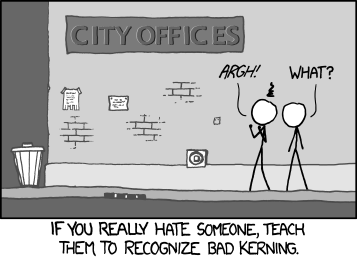
In the comic, the kerning in the sign is badly done: the spacing between C and I (in "City"), between C and E (in "Offices"), and even slightly between F and I (also in "Offices") is inconsistent. The space between the C and E is almost as wide as the space between the words. One character is clearly frustrated while the other character doesn't notice the problem at all.
The comic explains that once a person learns what good kerning is, he or she will get irritated by shoddy kerning in the future. Unfortunately, the comic itself has also taught us to be annoyed. Thanks, Randall.
The title text is written by Randall explaining that as he was writing this comic about kerning, he was very self-conscious of his own handwriting. The act of thinking about kerning (and likely, the act of drawing an example of such bad kerning) made him aware of it in his own writing.
Transcript
- [Some IDIOT used a font with TERRIBLE kerning on the side of a building for a sign labeled "CITY OFFICES".]
- [Only.. you aren't even frickin' sure because of this terrible kerning, as the "C" and the "I" in "CITY" have waaay too strong kerning. And so do the "C" and the "E" in "OFFICES", to the point that it actually looks like TWO words. And the I and the C are so close together, they almost look like a freakish K! Two people stand in front of this sign. One notices all these obvious flaws, while the other exists in peaceful ignorance.]
- Person: Argh!
- Cueball: What?
- If you really hate someone, teach them to recognize bad kerning.
Discussion
Did this to my "friend," and I must say it really hasn't had the intended effect. He's still happy and normal. Davidy22[talk] 13:08, 18 February 2013 (UTC)
A good website for anyone who really does want to learn about kerning is http://type.method.ac
SilverliteSword (talk) 19:30, 28 December 2016 (UTC)
The originial transcript in the html is:
[[Some IDIOT used a font with TERRIBLE kerning on the side of a building for a sign labeled "CITY OFFICES". Only.. you aren't even frickin' sure because of this terrible kerning, as the "C" and the "I" in "CITY" have waaay too strong kerning. And so do the "C" and the "E" in "OFFICES", to the point that it actually looks like TWO words. And the I and the C are so close together, they almost look like a freakish K! Two people stand in front of this sign. One notices all these obvious flaws, while the other exists in peaceful ignorance.]] Person 1: *Argh*! Person 2: what? If you really hate someone, teach them to recognize bad kerning.
Title text: I have never been as self-conscious about my handwriting as when I was inking in the caption for this comic.
Why isnt that used here? 108.162.254.4 (talk) (please sign your comments with ~~~~)
Firefox fails to display overlapped kerning. 141.101.92.24 15:56, 20 April 2015 (UTC)
The guy on the left might be so angry he'd try to punch the building -- but you can't fight City Hall. 108.162.219.107 15:51, 28 September 2015 (UTC)
The pen is broken, use finger. --173.245.48.89 22:06, 22 August 2016 (UTC)
Google is still showing the words "kerning" and "keming" in search results with one pixel of letter spacing added and removed respectively as of the time of writing. It should be noted that this isn't really kerning as such, just variable letter-spacing for the whole word AmbroseChapel (talk) 04:16, 11 September 2017 (UTC)
Oh my god I hate when that happens! Probably my OCD. StillNotOriginal 13:43, 20 May 2018 (UTC)
Microsoft Word has extremely bad kerning. Every time I use it, there's at least one case where I suspect a missing, duplicated or misplaced space. Just look at this abomination: https://drive.google.com/open?id=1bFVXEMo1Tio3pPrXvszN-_dFjUkNhyk2
There are 5 pixels before the comma and 5 pixels after the comma, even though there's supposed to be a space after it, but not before it. Fabian42 (talk) 11:07, 28 May 2019 (UTC)
Thanks, Randall. WHY. Sci09273.15 (talk) 20:22, 6 February 2023 (UTC)
