2389: Unread
| Unread |
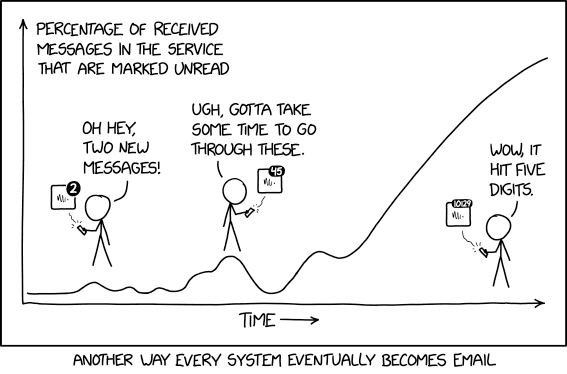
 Title text: I'll never install a smart home smoke detector. It's not that I don't trust the software--it's that all software eventually becomes email, and I know how I am with email. |
Explanation
| |
This explanation may be incomplete or incorrect: Created by a BOT. Please mention here why this explanation isn't complete. Do NOT delete this tag too soon. If you can address this issue, please edit the page! Thanks. |
Transcript
| |
This transcript is incomplete. Please help editing it! Thanks. |
Discussion
I have 27,333 unread emails. On the level of "Your email is important to me. Please wait and it'll get read eventually." Mikemk (talk) 00:25, 24 November 2020 (UTC)
Oh hai! https://i.imgur.com/FXt1AYq.png lol 172.68.142.195 10:17, 24 November 2020 (UTC)
You are all wusses - about 2 weeks ago when I looked, my ex-wife had over 750,000 unread emails. She wouldn't let me take a screenshot :P 172.68.86.112 00:05, 26 November 2020 (UTC)
- I'm guessing communication was a problem in your relationship? ;) --162.158.187.247 17:48, 30 November 2020 (UTC)
This graph seems way off to me. It says 'percentage of messages', so the highest point should be at the far left. At some point, you will have a single message saying "Welcome to WhateverMessagingService", which will initially be unread, therefore 100%. When he's standing at the beginning looking at the icon that says 2 messages, that's probably 2 out of 3, or 2 out of 4. It could be back up at 100% depending on the service (does it auto-delete read notifications?), but it's likely lower than at the start. But for the first few weeks, I'd expect to see a series of tall peaks, gradually getting lower as the number of old read messages slowly increases, with flat valleys inbetween where everything is read. Then as you get into the habit of putting off reading them, the valleys start getting shallower until they swallow the peaks, and you get a slowly rising curve that eventually levels off pretty high. This graph seems to rise forever at the end, which makes sense for a graph of the number of messages, but not for a percentage. Angel (talk) 11:34, 24 November 2020 (UTC)
- It says 'percentage **marked** unread' Torzsmokus (talk) 13:58, 24 November 2020 (UTC)
- The graph would also be quite rough. I imagine it's been smoothed to make sense, and (especially if the time axis is very long) these irregularities would all but disappear over time. As indicated by the 'eventually' in "Every system eventually becomes email", Randall/Cueball has probably used this service for a while. BlackHat (talk) 16:00, 25 November 2020 (UTC)
Which is why everyone needs filters for sub-mailboxes. Of those 27,333 , 27 000 go into the "IgnoreThisCrap" mailbox, 300 go into "Respond by the end of the next Sprint," and 33 remain as candidates for reading maybe after lunch. Cellocgw (talk) 11:36, 24 November 2020 (UTC)
Should the incomplete tag be deleted? This seems complete to me. 141.101.98.124 11:43, 24 November 2020 (UTC)
Should we link xkcd 1783? 172.69.34.208 18:24, 24 November 2020 (UTC)
There's one error in this comic. The curve at the right edge of the graph implies that the number of unread emails grows logistically on large enough timescales. In my experience, it's linear at best and exponential at worst. GreatWyrmGold (talk) 15:16, 25 November 2020 (UTC)
- While the number might better follow an exponential graph, the axis refers to the percent of unread messages. Since this can't be higher than 1, or 100%, the graph has to be logistic in order to cap at the maximum limit. Unless, of course, your inbox grows so quickly that you have more unread emails than emails, and for all we know that might happen. BlackHat (talk) 16:00, 25 November 2020 (UTC)
my inbox in a nutshell An user who has no account yet (talk) 22:40, 2 September 2023 (UTC)
I can't let any emails go unread. I hate the notification icon taunting me with the funny numbers. P?sych??otic?pot??at???o (talk) 13:00, 19 September 2024 (UTC)
