Talk:2736: Only Serifs
first two letters are "A" and "R" I think 172.71.167.10 04:35, 11 February 2023 (UTC)Bumpf
It's AaBbCcDd. Most likely in Caslon, based on the uppercase A. 172.68.174.149 04:54, 11 February 2023 (UTC)
- Came here to see if anyone had deciphered the text in this comic. Was not disappointed. 172.70.144.8 23:29, 13 May 2025 (UTC)
So much for a hidden message. 172.68.238.22 05:05, 11 February 2023 (UTC)
If we've come to this page for an explanation, we probably don't know what a "solum-serif font" is. update the transcript with something more widely known? 172.69.65.224 05:42, 11 February 2023 (UTC)
- Agreed, enthusiastically! Someone trying to show off, Google doesn't even know what it means, it found ONE result, which is a font of curved corners someone made (when I put "solum-serif" in quotes, to not allow Google to just search one or the other). But while I was Googling someone fixed it before I could, LOL! Which is weird as it's past midnight here in the Eastern time zone. :) NiceGuy1 (talk) 05:56, 11 February 2023 (UTC)
- Perhaps you haven't realised that nighttime for Americans is daytime for, um, somewhere around 80-90% of the world's population? Paddles (talk) 14:54, 11 February 2023 (UTC)
- Of course I realize this. :) Seems like YOU don't realize that this site is one of many where it seems like most activity centers around the EST time zone... Perhaps related to Randall being in this time zone, perhaps not, but I'm usually alone at this time of night (for example, I almost NEVER get Edit Conflicts because seemingly everyone is asleep). For years I'm almost always the only person making contributions at this hour. Maybe think of that before making a misguided condescending reply. :) NiceGuy1 (talk) 06:19, 12 February 2023 (UTC)
- You really live up to your username, eh? Charming and US-centric. 172.71.242.87 (talk) 16>:50, 13 February 2023 (please sign your comments with ~~~~)
- I live on the west coast. I edit around 9pm sometimes (EST midnight). 172.71.158.23 (talk) 23:00, 11 November 2023 (please sign your comments with ~~~~)
- Of course I realize this. :) Seems like YOU don't realize that this site is one of many where it seems like most activity centers around the EST time zone... Perhaps related to Randall being in this time zone, perhaps not, but I'm usually alone at this time of night (for example, I almost NEVER get Edit Conflicts because seemingly everyone is asleep). For years I'm almost always the only person making contributions at this hour. Maybe think of that before making a misguided condescending reply. :) NiceGuy1 (talk) 06:19, 12 February 2023 (UTC)
- Perhaps you haven't realised that nighttime for Americans is daytime for, um, somewhere around 80-90% of the world's population? Paddles (talk) 14:54, 11 February 2023 (UTC)
- I think that's probably because it was a joke. In fact the ridiculous of the notion of a "solum-serif" font is more or less the entirety of the joke of this comic. You're right, in the future we should make sure that these descriptions are devoid of humor.172.70.211.92 18:17, 11 February 2023 (UTC)
- But that's in the transcript particularly, the transcript should make sense as to what the image shows without prior knowledge 108.162.216.10 02:45, 12 February 2023 (UTC)
- Yes, as Mr./Ms. 216.10 pointed out, this was the transcript. PLENTY of room for jokes in the Explanation, but the Transcript should be as concise and straightforward as possible, in an effort to be clear. NOT the place for what seemed to be a self-coined term and trying to be clever. :) I've heard some blind and sight-impaired people follow the comic by having a reading program read these Transcripts, last thing they need is a non-word the program might trip over and can't define for them. NiceGuy1 (talk) 06:19, 12 February 2023 (UTC)
- For anyone who is confused, 'solum' (solus) is Latin for 'only', as opposed to 'sans' (from the Latin 'sine'), without. I suppose the joke is rather hard to get, though, since the top Google search results for 'solum' refer to soil. (Not my joke, by the way. Also, first ever comment - hope I've done this right.) CryptekCathekh (talk) 21:21, 11 February 2023 (UTC)
- I think that's probably because it was a joke. In fact the ridiculous of the notion of a "solum-serif" font is more or less the entirety of the joke of this comic. You're right, in the future we should make sure that these descriptions are devoid of humor.172.70.211.92 18:17, 11 February 2023 (UTC)
There was a whole thing on Wikipedia about formatting the f symbol for an arbitrary function. One camp held that f is just f, it always is and always was and if you italicize f in a san-serif font, you get an oblique f but if you italicize f in a serif font, you get a proper italic version, which I'm not sure how to display here. The italic f resembles ƒ, a character called the "hooked f," which is technically an oblique f with a descender ("hook"). That symbol has been used for florins, but sometimes it is also used to imitate the italic f to represent functions, because it has the descender in all environments. But Wikipedia uses a san-serif script, while most mathematical literature uses a serif script. However, it renders expressions in LaTeX with serif fonts and therefore these equations get an f with a descender. So some people were arguing that given this environment, the ƒ character was practically superior, even if it was conceptually wrong, because it most closely resembled the formatted LaTeX expressions. And on and on with the back and forth. I'm glad they eventually settled on just using f for f, like they use g for g and h for h, but still, it was amusingly nitpicky. 172.70.100.50 07:58, 11 February 2023 (UTC)
- What you listed as resembling italic f looks on my system like ⨍. There are lots of fun variations (some unrelated, just similar looking): ∫⨎ʄ∮∬∰⨏ƒʆᶘᔑ Fabian42 (talk) 08:48, 11 February 2023 (UTC)
- That entire argument seems silly. Obviously the correct answer to "how do you write the function $f$ outside of math mode" is "don't". Just use math mode and let KaTeX handle the formatting. --162.158.63.61 16:48, 12 February 2023 (UTC)
The title text teases the idea of a font made by adding the Times New Roman serifs to Comic Sans, and now I actually want to see such a cursed font. 108.162.241.237 11:03, 11 February 2023 (UTC)
- Ask and ye shall receive:
 :) NiceGuy1 (talk) 08:42, 13 February 2023 (UTC)
- Is it weird that I kind of like Sans New Roman? (anonymous) 12:49, 13 February 2023 (EST)
- Thanks I will include this in the explanation. Great work. Ugly as hell ;-) It might send some graphic designers your way! ;-) --Kynde (talk) 13:42, 13 February 2023 (UTC)
- i think it improves both typefaces Boatster (talk) 22:22, 14 February 2023 (UTC)
- Awww, thanks, I'm honoured! And I likewise kinds like Times Sans, particularly the capital C (after I cleaned it up, my paint program kept half-assing the Cut, several pixels taking a grey and leaving a grey) NiceGuy1 (talk) 06:14, 18 February 2023 (UTC)
I think Caslon is correct: Caslon Overlay Low Opacity Overlay via questions in Identifont. If someone can add these to the wiki, please do. DragonDave (talk) 12:55 11 February 2023 (UTC)
I wonder if this is related to the US State Department dropping Times Roman in favor of Calibri, under the argument that the latter is easier to read. --172.70.114.198 13:47, 11 February 2023 (UTC)
I call these fonts seul serif, keeping with the theme of using French terminology. 172.71.147.59 16:30, 11 February 2023 (UTC)
A free, existing example of Comic Serif. 172.70.214.242 16:43, 11 February 2023 (UTC)
- ^ TBH Comic Serif doesn't look half bad, if only it had a consistent baseline 198.41.231.179 17:01, 11 February 2023 (UTC)
- Of course, since Comic is supposed to mimic casual handwriting, and people don't hand write serifs [citation needed], this messes up the concept, LOL! NiceGuy1 (talk) 07:02, 12 February 2023 (UTC)
- Does not, if you go back far enough. Remember that a lot of old handwriting had serif-like parts due to the use of quills. 162.158.203.40 (talk) 11:48, 12 February 2023 (please sign your comments with ~~~~)
This comic reminds me of something I once actually did as a child: I once wrote a notepad full of game ideas and story concepts but wanted to keep them a secret; so I created my own "cipher" font where any straight lines in letters were removed, leaving only the curved lines. However, because some letters such as c and d would look similar without the straight lines, I gave some letters curved "serifs", which would be retained in my "font". [email protected] 20:32, 11 February 2023 (UTC)
I'm most instances where the word "font" is used, the correct word is "typeface". "Times Roman" is a typeface whereas "Times Roman bold" is a font. -Jez 172.70.93.42 20:56, 11 February 2023 (UTC)
- I'd be inclined to suggest that "font", in common parlance, means what everyone here means it to mean, and that means that it is "correct". Nobody - OK, fine, potentially a negligible number of people - might wonder what's going on when "font" is used where you would prefer "typeface". It's not a matter of being "correct" though, unless we are (and we aren't) a community of people using typesetting language in a formal, technical sense. You know what is incorrect though? Writing "I'm" when you mean "In". Would I have said any of that had you not been so pedantic? You bet your sweet ass I wouldn't.Yorkshire Pudding (talk) 22:08, 12 February 2023 (UTC)
That can't POSSIBLY be the right link under the word "events". We have an entire category of "my hobby"/"Cueball getting kicked out of events" comics and that isn't any of them. 172.71.158.90 22:29, 11 February 2023 (UTC)
- I concur. It links directly to comic 514, which has nothing to do with events or getting kicked out (I can't even think what comic they meant). I took a peek at 1514 and 2514, but those don't fit, either. ??? NiceGuy1 (talk) 07:07, 12 February 2023 (UTC)
- Maybe 541 was meant? But I guess just linking to Category:Banned_from_conferences or even adding this to Category:Compromise would be better. --198.41.242.166 14:58, 12 February 2023 (UTC)
- Yup, I feel sure you got it. I tried checking around 514 (going up to like 518, going down to like 510), didn't try transposing the digits. What's funny is that I often think of that specific comic 541, whenever I want a smiley face inside brackets, :) I'll update the explanation. EDIT: Ugh, someone removed it instead of fixing it. :( NiceGuy1 (talk) 08:42, 13 February 2023 (UTC)
- Maybe 541 was meant? But I guess just linking to Category:Banned_from_conferences or even adding this to Category:Compromise would be better. --198.41.242.166 14:58, 12 February 2023 (UTC)
It looks very similar to Comic Sands by tom7! 172.71.30.106 16:49, 12 February 2023 (UTC)Bumpf
- Oh incredible, I quite like the "futura work" section of that paper MrCandela (talk) 03:52, 13 February 2023 (UTC)
I'm gonna make the comic sans/times new roman hybrid when I can get some time. Just calling dibs! Mushrooms (talk) 07:54, 13 February 2023 (UTC)
- yeah, this is just "comic serif". It already exists here Mushrooms (talk) 08:00, 13 February 2023 (UTC)
- Sorry, I already decided last night I would and I just made it before I read your dibs, guess I should have said something, :) Not going to throw out my work! :) NiceGuy1 (talk) 08:22, 13 February 2023 (UTC)
- It's fine! I kinda abandoned it anyways and I don't think I would have done quite as good a job Mushrooms (talk) 09:04, 13 February 2023 (UTC)
- I'd gotten as far as starting to manually tweak the tween-frames in a rather self-indulgent animated version. But your thing is as good as needs to be, and I don't have upload permissions here anyway, so it would have been too much fuss and probably just contributed to my own personal procrastination over the weekend. ;) 172.70.91.17 (talk) 13:43 13 February 2023 (please sign your comments with ~~~~)
- I have no reason to think I'd have upload permission either if there are people who don't, except my membership is a few years old. I don't think I've even had a Talk page for a year yet, and someone created that just because I said I didn't know why I wouldn't have one. This was my first ever upload, I had to look up how. (Simply starts with being logged in and clicking "Upload a file" in the menu on the left). NiceGuy1 (talk) 06:50, 18 February 2023 (UTC)
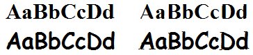
In case anyone wanted to know what it would look like if you moved the serifs from Times New Roman to Comic Sans, here's the before and after. :)  NiceGuy1 (talk) 08:22, 13 February 2023 (UTC)
- Please also adapt the kerning! This hurts my eyes. --198.41.242.166 11:10, 13 February 2023 (UTC)
- I actually already knew what kerning was! And I know, right? But I wanted to leave everything else alone, just Cut and Paste the serifs, that's it, leave them as comparable as possible (in case it isn't clear, this was a case of Nerd Sniping). :) Maybe should have separated each letter with a space... NiceGuy1 (talk) 06:33, 18 February 2023 (UTC)
Randall's font isn't only serifs - there are some ball terminals in there as well.172.70.91.114 11:59, 13 February 2023 (UTC)
Any guesses on what the text in the comic actually says? 172.70.111.75 15:41, 13 February 2023 (UTC)
- As the second comment in this talk box suggest, I think the serifs are consistent with AaBbCcDd (an easy way to showcase a typeface in a few characters). If I'm not mistaken, the transcript used to imply as much as well; does anyone know why that was removed, and can we be confident enough about the text to put that back in the transcript?
- Also, sorry about not signing above. Dextrous Fred (talk) 19:55, 13 February 2023 (UTC)
- It's also mentioned in the (rather long) first paragraph of the Explanation. Better place. Might do better with some restructuring of the text, I might split/refactor the scrawl at some point, along the lines of various sub-points all squashed in there... 172.70.91.113 23:06, 13 February 2023 (UTC)
I wonder whether this was a play on Only Fans -> Only Sans -> Only Serifs? 172.70.230.25 (talk) 03:22, 14 February 2023 (please sign your comments with ~~~~)
- If I know my fellow XKCD fans, it's only a matter of days until we'll see someone upload SEULSERIF.TTF --162.158.129.138 18:01, 14 February 2023 (UTC)
I made a version of this comic with the faint text "Aa Bb Cc Dd" overlaid in Times New Roman, showing how the serifs match up to the text, but I don't seem to have permission to create new pages so I can't upload the file. Can someone else do it for me and edit the article appropriately? The image is at https://matrix.theblob.org/2736-spoiler.png. --Sophira (talk) 20:07, 16 February 2023 (UTC)
- I have no reason to think I'd have permission to upload if other people can't (except my membership is a few years old now), but when I wanted to - the Times/Comic Serif hybrid picture above - I just had to look up how (which starts simply by being signed in and clicking "Upload a file" on any page). Are you sure you don't have permission? NiceGuy1 (talk) 06:50, 18 February 2023 (UTC)
- Quite sure. The upload form loads fine, but when I try to actually upload the image, it comes back with the error "You do not have permission to create new pages." --Sophira (talk) 12:27, 8 March 2023 (UTC)
- That seems weird. Only things I can think of is either 1) You need an account of a certain age or contribution history, 2) It wants you to verify your email address (have you?) or 3) It wants you to have a User page and/or Talk page. I just created those, so maybe it'll work now? NiceGuy1 (talk) 20:17, 10 March 2023 (UTC)
- Quite sure. The upload form loads fine, but when I try to actually upload the image, it comes back with the error "You do not have permission to create new pages." --Sophira (talk) 12:27, 8 March 2023 (UTC)
OMG, as I type this I'm at karaoke, and someone is singing a homemade karaoke track with the lyrics in Comic Sans! Coincidences dominate my life! NiceGuy1 (talk) 06:50, 18 February 2023 (UTC)
Is there An alphabet where the serifs affects the meaning? 127.0.0.1 (talk) 23:49, 25 February 2023 (UTC)
- The Cherokee syllabary may be an example. ColorfulGalaxy (talk) 12:39, 4 March 2023 (UTC)
I made another version of the "Comic Serif" font. You can see an example here: https://imgur.com/a/WET4WvT. 108.162.245.46 19:53, 25 March 2024 (UTC)
