2031: Pie Charts
| Pie Charts |
 Title text: If you can't get your graphing tool to do the shading, just add some clip art of cosmologists discussing the unusual curvature of space in the area. |
Explanation[edit]
Pie Charts graph proportions as "slices" of a circle, like a pie that you cut into slices. The circle, or Pie, represents the whole sum of the slices, or 100% of the data. As such, if the data represented by the slices is expressed as percentages, the total of all the slices, by definition, must total 100%. This comic introduces a new technique for getting around that rule by "warping" the circle to allow more than 100% of the data to exist in the graph. Thus the total amount of 130% is represented with a shape that bends out of plane in order to fit a 30% larger area into the footprint of a circle.
This shape does not aid in understanding the figures. At best, it serves to highlight a methodical error. Pie charts are intended to represent nonoverlapping fractions of a whole. If the entire pie does not represent the whole, and each sector a disjoint piece, then the pie chart is misleading and may be impossible to draw. A different type of chart should be used.
Percentages that add up to more than 100% are often a sign that a math error has occurred, whether a typo somewhere or a sloppy case of taking numbers from different sources. However, they can arise naturally in cases where each item can belong to more than one group, such as approval voting (40% of the people like green 45% like red etc., however there may be some that like both green and red). In such cases, a more accurate depiction would have some form of overlap of the pie pieces, not a warping of the space which they occupy. For instance, for 2 colors, Red and Green, the pie chart could have four sectors: approval of both R and G, of just R, of just G, and of neither R nor G. These will necessarily add to 100%, since they exhaust all logical possibilities. If this is impossible or confusing, a completely different representation should be used, such as a bar chart. An exception can occur if the percentages of the pieces have been rounded for readability—the percentages do indeed sum to 100, but after they are each rounded individually, the rounded numbers can sum to a slightly different value. This is still appropriate for a pie chart, and when charts like this are published, a small notice is sometimes published beneath it explaining the discrepancy due to rounding. If each group is rounded to the nearest 1%, with 0.5 rounded up, then the maximum possible sum of rounded percentages is (100+⌊n/2⌋)%, where n is the number of groups and ⌊•⌋ is the floor function. For instance, with groups of size 0.5%, 0.5%, 0.5%, and 98.5%, they would round up to 1%, 1%, 1%, and 99%, for a sum of 102% = (100+4/2)%.
Percentages don't need to add up to 100% to be correct. For example, if ten people wear blue t-shirts and ten wear red t-shirts, then 50% of them wear each color for a total of 100%. Now if one of each joins the group, 55% of the original population wears each color, for a total of 110%, as the total population risen by 10%. That said, this change should be represented by something like a bar graph, not by pie chart. If percentages are represented by a pie chart, the assumption is that the total should be 100%, independently of the math behind it.
In this case, the right image appears to be what happens when you cut the pie chart segments out of fabric, stitch them together, and let the resultant fabric flop around a bit.
The title text presents an alternative if shading is not possible, namely using clip art of scientists to imply that the chart is curved (thereby excusing the percentage inaccuracy) because the space it occupies is itself curved. Unfortunately this would be rather difficult, as clip art of scientists discussing this very particular cosmological phenomenon is not readily available.[citation needed]
Transcript[edit]
- [Two colored circles are shown. The circle on the right is warped and bent in shape and shows some shadows from the middle to the outer edges, like a round piece of cloth with wrinkles going out from the center.]
- [The left pie chart:]
- Wrong:
- 45% (red)
- 15% (blue)
- 30% (yellow)
- 40% (green)
- [The right warped and bent pie chart with shadows:]
- Right:
- 45% (red)
- 15% (blue)
- 30% (yellow)
- 40% (green)
- [Caption below the frame:]
- How to make a pie chart if your percentages don't add up to 100
Discussion
I wonder if it is a coincidence that this came out the same week as Android Pie Zachweix (talk) 15:34, 10 August 2018 (UTC)
Zachweix seems to want to share this link: Fox News --NeatNit (talk) 16:56, 10 August 2018 (UTC)
- What's wrong with the link? The link in that page is exactly the type of pie chart to which he is referring Zachweix (talk) 16:57, 10 August 2018 (UTC)
- Wrong just in the sense that it's a temporary place, but I think it adds to the humor of referring to Fox News in the "who created this page" piece. It might be appropriate to add it to a section of real world examples of published pie charts that fail the "mostly 100%" test (aside from trivial rounding errors). -boB (talk) 20:40, 10 August 2018 (UTC)
That's not a hyperbolic plane. It's more like a cone, but with more than 360 degrees instead of less. I don't know the proper term for it. It has curvature zero everywhere except the center, which is a singularity. DanielLC (talk) 19:00, 10 August 2018 (UTC)
- Agreed. This has nothing to do with the hyperbolic plane. That image does have some saddle points, and maybe that's where the idea came from. A hyperbolic plane is sort of like a space where every point is a saddle point, not just some points. You can't draw it. EebstertheGreat (talk) 01:26, 8 July 2023 (UTC)
Any explanation of the title text? An example of the clipart would be great. 172.68.47.54 00:26, 11 August 2018 (UTC)
- I wouldn't take it too literally. Clipart is just easy to use, cheap-looking iconography. I highly doubt there's clipart of cosmologists. You could just put in little stick figures saying like "the curvature of the space here is unusual" and you'd get the same effect. 162.158.62.147 17:08, 13 August 2018 (UTC)
I don't think there is a method to the madness guys, it looks like he just took an editor's warp tool and held it in place. 172.68.59.24 14:35, 11 August 2018 (UTC)
- Edward Tufte on Pie Charts
Maybe we should also mention what the dodfather of visualization has to say on pie charts: Edward Tufte gives the pie chart a more succinct and decisive treatment in "The Visual Display of Quantitative Information": A table is nearly always better than a dumb pie chart; the only worse design than a pie chart is several of them, for then the viewer is asked to compare quantities located in spatial disarray both within and between charts [...] Given their low density and failure to order numbers along a visual dimension, pie charts should never be used. (Tufte: "The Visual Display of Quantitative Information", quoted by https://news.ycombinator.com/item?id=2991062 )
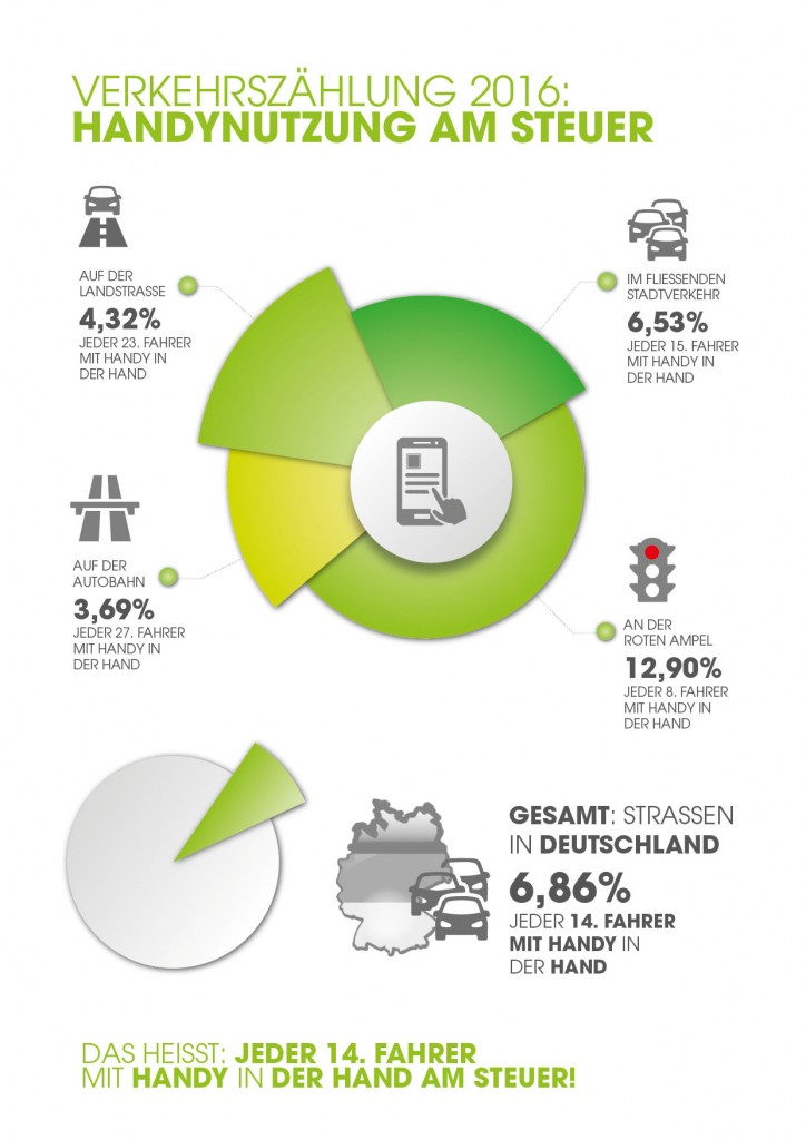
(previous editor did not sign) My favourite missapplied chart is a doughnut chart (which is a piechart without of the center comes from one of Germanys big automobile clubs. They made a campaign about how dangerous it is to use a phone in the car, and part of it was a statistic wher ethey would find out, at various places (red light, motorway, city trafic or country roads) what percentage of people would use their cell phone. They summarized it in a doughnut chart which does not make any sense: https://www.mobil.org/wp-content/uploads/2016/08/%C3%9Cbersicht-Verkehrsz%C3%A4hlung-2016-Mobil-in-Deutschland-e.V-1-724x1024.jpg Lupo (talk) 16:29, 14 August 2018 (UTC)
- It took me a while to figure this one out. I kept thinking it was representing data on two axes, like some sort of combined pie chart/polar area diagram. Like a spie chart, but working in some different, unfathomable way. But no, the radial dimension means nothing, it's just used to help clarify the borders. They took a bunch of percentages of different groups, then put them together in a bar chart, decided they didn't like how the bars looked, and told Excel to turn it into a pie chart. So it added the percentages to get a total, then divided each data point by that, and used the results to make a completely meaningless pie. It's like discovering that skim milk is 0.5% fat, whole milk is 3.5%, and cream is 36% fat: adding them up gives 40, so you make a pie chart where skim milk is 1/80 of a circle, whole milk is 7/80, and cream is 72/80. And then you gave each sector a random radius and shade of green. So, so, so dumb. EebstertheGreat (talk) 02:15, 8 July 2023 (UTC)
Come on guys, the blue slice is CLEARLY the intersection of the red and yellow slices. It all makes perfect sense once you realize that. His pie chart isn't wrong, it's just a Venn-Pie-o-gram 172.69.50.4 00:51, 16 August 2018 (UTC)
It's always entertaining when two people come in to clarify the same point with different enough rhetoric and examples that they don't realize they're clarifying the same point. GreatWyrmGold (talk) 22:46, 24 October 2025 (UTC)