993: Brand Identity
| Brand Identity |
 Title text: Legally-mandated information would be printed on the back or discreetly along the bottom. In small letters under the nutrition information it would say 'Like our products? Visit our website!' There would be no URL. |
Explanation[edit]
This comic presents Randall's idea for a line of food products all with clear black font on a white background. The products with black block lettering and white background stand out from the other items in this comic. The irony is that even though the branding isn't terribly creative, the lack of complexity is what causes the products to stand out. These product packaging styles resemble no-frills products and generic brands. For example, in Canada, the "No Name" generic brand of low-cost products sold by Loblaws features a plain yellow label with the description of the product in bold black text, and occasionally an image of the product (for people who can't read). The brand name is minimalized, as are other legally-required elements (e.g., the weight of the product). Another of Loblaws' generic brands, President's Choice (PC), currently has a plain white background with black bold text for the labels on most of its products (usually with an image of the product as well as the brand name), although more recently, text in accent colors has been introduced.
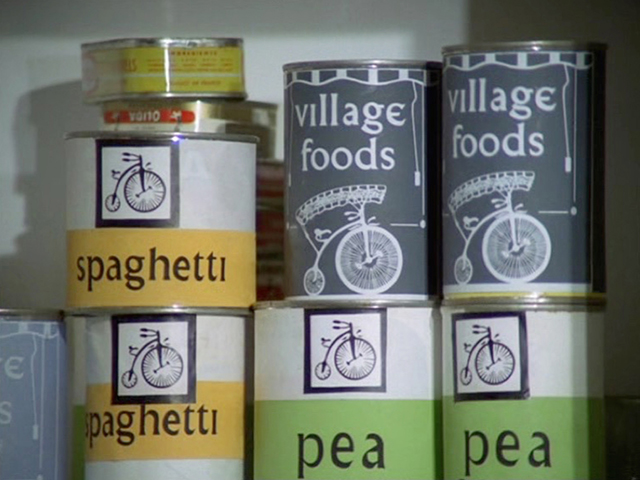
The style of packaging might be a reference to The Prisoner TV series from the '60s, a dystopia set in a village ("the Village") locked out from the outside world. The shops there sell only "Village food", as seen in this example.
In the title text, the lack of a listed URL relates to the lack of branding on the package. It is possible that by omitting the URL, the consumer's curiosity will be aroused and they'll search the internet for the actual site.
List of all products in the shelves[edit]

- [1] Rainbow
- [2] Ruffles
- [3] [unreadable]
- [4] Potato Chips [new brand]
- [5] [unreadable]
- [6] cheese crackers [Flavor 1]
- [7] cheese crackers [Flavor 2]
- [8] - [12] [unreadable]
- [13] [?] Beets
- [14] - [16] [unreadable]
- [17] Tissues [new brand]
- [18] cervical caps [what product is this? see comments]
- [19] [unreadable]
- [20] blue stripe shells
- [21] ear tonic
- [22] - [24] [unreadable]
- [25] - [26] [unreadable]
- [27] Crackers [new brand]
- [28] - [29] [unreadable]
- [30] Matches [new brand]
- [31] - [32] [unreadable]
- [33] Peanuts [new brand]
- [34] hot sauce [probably not the new brand, see comments]
- [35] - [40] [unreadable]
- [41] sugar [probably not the new brand, see comments]
- [42] - [45] [unreadable]
- [46] Milk [new brand]
- [47] - [48] [unreadable]
- [49] Pasta [new brand]
- [50] caccalion [there is no pasta named like this says the List of pasta]
- [51] free
- [52] [unreadable]
- [53] coffee
- [54] [unreadable]
- [55] Coffee [new brand]
- [56] - [61] [unreadable]
- [62] white beans
- [63] - [66] [unreadable]
- [67] sanfra beans [there are no beans named like this says the Bean#Types]
- [68] pinto beans
- [69] bean
- [70] pinto beans
- [71] Black beans [new brand]
- [72] [unreadable]
- [73] do beans [there are no beans named like this says the Bean#Types]
- [74] black beans
- [75] [unreadable]
- [76] lima beans
- [77] Lima beans [new brand]
- [78] fart cutters
- [79] three [unreadable] can
- [80] [unreadable]
- [81] pine + giant bean
- [82] beans with [unreadable]
- [83] refrie[d beans; unfinished due to bowing of can]
- [84 top] [unreadable]
- [84 middle] [unlabeled]
- [84 bottom] Bees
- [85] [unreadable]
- [86] mayonnaise
- [87] roo's simple mayo
- [88] simp[le] mayo [unfinished word due to bowing of can]
- [89] Mayo [new brand]
- [90] [unreadable]
- [91] red meat sauce
- [92] [unreadable]
- [93] oil
- [94] [unreadable]
- [95] oil
- [96] Ketchup [new brand]
- [97] - [98] [unreadable]
- [99] maple syrup
- [100] - [101] [unreadable]
- [102] eye sand
- [103] tea [yellow package with clear black font]
- [104] tea
- [105] - [106] [unreadable]
- [107] tea
- [108] country loaf
- [109] Bread [new brand]
- [110] white bread
Transcript[edit]
- [The incredibly varied shelf of a supermarket aisle. There are many different types of products on this shelf. Each type has numerous different brands, all surrounding a very plain brand that has, as its only label, the type of product. A plain bag, labeled in plain black letters, says "Potato Chips" and is surrounded by all the other various brands of potato chips. The same exists for tissues, crackers, matches, peanuts, hot sauce, sugar, milk, pasta, coffee, black beans, lima beans, mayo, ketchup, tea, and bread. There is a stark contrast between the incredibly noisy and complex labeling of every other brand and this simple one.]
- [Caption below:]
- If I ever sold a line of supermarket goods,
- this is how I'd build a brand identity overnight.
Discussion
The Swedish company Konsum had a line of products called "Blåvitt"(blue and white) which had a minimalistic approch. Some examples 162.158.134.18 13:51, 5 May 2020 (UTC)
Notice that the sugar is inverted? Weird. --Classhole 23:22, 24 January 2013 (UTC)
- Weird, the hot sauce is also inverted BlueRoll18 (talk) 02:38, 7 February 2013 (UTC)
- Possibly a reference to inverted sugar syrup. Liyang (talk) 05:44, 5 May 2015 (UTC)
NONAME in Canada uses yellow boxes with black text but basically the same idea. --Pundawg 18:56, 19 February 2013 (UTC)
I didn't get this joke because I grew up eating "Slim Price" food branded exactly this way. -lolo 99.120.200.86 (talk) (please sign your comments with ~~~~)
There's a brand called "Ja!" from the Rewe group in Germany that uses this exact concept somewhat, but nowadays, the packages contain pictures and illustrations of all kinds, and aren't as white, simple and plain as they used to be in the past. See: http://www.rewe.de/besser-einkaufen/ja/produkte-und-infos.html --Rolfhub 23:25, 14 September 2013
- Here is some old image of the designs: [1]. It's not as simple as in the comic, but it's certainly the same idea. -- 108.162.219.39 20:25, 24 April 2014 (UTC)
- Ah, dear old "Ja!"... it saved my life back when I was a broke student. Anyway, also the M-Budget line from Swiss Migros recently started adding pictures to its product, but before that it was all green packaging with black writing. Wonerful --108.162.229.31 13:36, 26 May 2014 (UTC)
- "Ja!" is a very successful brand sold in Germany (and more countries) offered by REWE. The products are presented in a white cover, just showing the word "Ja!" ("Yes!" in English) and much smaller the content of the product. Maybe this could also be mentioned at the trivia section. --Dgbrt (talk) 21:55, 26 May 2014 (UTC)
I think the lack of URL is just to troll the consumers. 173.245.63.180 00:33, 13 November 2013 (UTC)
Actually several brands in the Netherlands did this before the comic was posted. They switched to a red/white two-colour scheme with the product in large letters in English. The problem was, that multiple brands did this, which made them look very similar. 141.101.75.95 16:09, 8 December 2014 (UTC) Hey, something seems wrong with the IP logging. The logged IP is not mine. -- 141.101.75.95 16:11, 8 December 2014 (UTC)
- About multiple brands looking the same. Contrary to "tragedy of the commons", "prisoners dilemma", or "what if everyone act like that" https://xkcd.com/958/ , this is not a problem. It would actually be approaching utopia. When people look for distinguishing features, they would have to, like, read the nutrition on the back, or look for comparison prices. I.e. relevant info, instead of "oh shiny". /David A 141.101.80.33 05:36, 24 August 2016 (UTC)
For a couple of decades this exact thing existed: http://www.google.com/search?q=black+on+white+generic+brand+products In fact I'm certain that that is the joke.108.162.215.156 07:38, 11 March 2015 (UTC)
I believe this may be a reference to the film Repo Man. 141.101.98.170 (talk) (please sign your comments with ~~~~)
I don't know how common Muji stores are in the US (where I imagine most readers reside), but this is basically what they've been doing since the 1980s. Liyang (talk) 05:33, 5 May 2015 (UTC)
Soylent 2.0 is doing this exact thing: https://soylent-production-herokuapp-com.global.ssl.fastly.net/static/images/drink_secondary_messaging_block1.3571d250b954.jpg Interestingly, that image is very similar to this comic.03:36, 7 February 2016 (UTC)
I was at walmart the other day and noticed a brand doing this, without even a brand name. Mikemk (talk) 20:31, 23 March 2016 (UTC)
- /* Trivia */
Randall made a mistake as the ketchup is labeled "kerhup" 108.162.245.118 (talk) (please sign your comments with ~~~~)
- No, if you zoom in it'sthe letters 'TC', which overlap slightly because of the cramped bottle. 141.101.98.133 (talk) (please sign your comments with ~~~~)
Why is the tea box green except for inside the A?Bbrk24 (talk) 00:23, 4 May 2016 (UTC)
- It's actually yellow; you may wish to check to see if you are colorblind. There are many errors in filling in spaces that should be colored, though. --108.162.244.79 01:33, 9 July 2016 (UTC)
This comics have spawned a thread on reddit https://www.reddit.com/r/xkcd/comments/nkytu/brand_identity/ . It appears there was a no-brand car i Japan: https://en.wikipedia.org/wiki/Muji#History /David A 141.101.80.33 05:02, 24 August 2016 (UTC)
The generic milk is in a plain glass or plastic container on the shelves of the grocery section of this store, not in the refrigerated cooler. Milk stocked in this location will spoil rapidly. Only aseptically packaged milk can sit on a warm shelf for extended periods without spoiling. These Are Not The Comments You Are Looking For (talk)
What product is [18]? If this contains, as I read, Cervical caps it makes no sense to sell them in a bulk pack as a cervical cap is a reusable contraceptive device. Or does it refer to soft tampons as menstrual management device? The latter would fit better to the picture, but not to the text... As I am from Germany, I am not familiar with the common products offered in a supermarket. Perhaps anyone can help? --LaVe (talk) 10:59, 24 February 2017 (UTC)
- I agree - that *really* looks like it says "cervical caps". Perhaps he meant menstrual cups? They are similar in appearance, but for capturing blood flow, not for contraception. Some of them are intended for wash & re-use, but others are disposable from month-to-month, justifying the multi-pack. L-Space Traveler (talk) 22:02, 19 November 2022 (UTC)
Why would 6 and 7 be errors when many brands of crackers have multiple flavors with the packaging just changing to show the flavor difference. 162.158.62.231 13:31, 24 August 2017 (UTC)
I would buy clearly labeled "shampoo", "conditioner" etc. The ones sold in the stores where I live list the brand, the product effect, some slogans, what it contains or smells like, some more slogans, bottle volume etc. And in a tiny font somewhere between the lines, the actual product type. :( 108.162.241.178 23:56, 24 October 2017 (UTC)
Apparently, the Pathmark supermarket chain used to employ exactly this strategy: https://www.retroist.com/2018/01/30/no-frills-products-pathmark/ 172.69.54.69 20:41, 14 March 2018 (UTC)
Why are there so many unreadable ones? There could be Lays and stuff. Maybe Kleenex. But at least put more real brands. Or don't. StillNotOriginal 21:01, 20 May 2018 (UTC)
Public Goods seems to be the most recent high-profile company to adopt this kind of simplified black-on-white, one-choice-per-product labeling. Clearly this idea is as old as the hills. In fact, every single commodity product found on shelves in the Lascaux Caves is labeled just like this. Dvgrn (talk) 18:02, 30 August 2019 (UTC)
At the end of 00's, every major chain of convinience stores adopted the idea of "own brand", distinguishable as "outstandingly plain white box" (as seen in Moscow). It all started after Auchat got in Russia, offering "ridiculously" cheap stuff in white boxes with small illustrations and big black text on it. Merci beacoup, monseur Auchan.172.68.244.55 12:20, 31 December 2021 (UTC)
- Speaking of Auchan, their "kazhdy den" ("every day" in English) line looks especially bland: [2]
And after years of collecting actual brands that do almost that, there's now a fictional occurrence in popular media which implements exactly this comic's idea: the supermarket in Netflix' 2022 movie White Noise (see YouTube Featurette at 3:09 for an image). --198.41.242.167 10:11, 11 January 2023 (UTC)
- Perfect! It would stand out even among those Kazhdy Den', Krasnaya Tsena, Pervym Delom or M-Budget, Blavitt, "Ja!" etc. White Noise's chips indeed look extra simplified thanks to an Arial family font. 172.71.122.214 08:30, 18 April 2024 (UTC)
 Add comment

![[1]](https://web.archive.org/web/20040503194438im_/http://www.rewe-ja.de/nxMODULES/nxCONTENTER/content/1_425Bild1.jpg)
![[2]](https://i.ytimg.com/vi/EA558itYNw8/maxresdefault.jpg)